
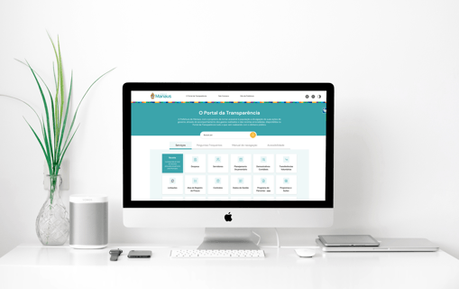
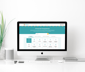
This case on the Transparency Portal contains various official public information, which will be done with the aim of increasing citizen participation in public processes.
🚀 About Case
Company - Cesar
Type - Product design
Year - 2021
01
This case on the Transparency Portal contains various official public information, which will be done with the aim of increasing citizen participation in public processes.
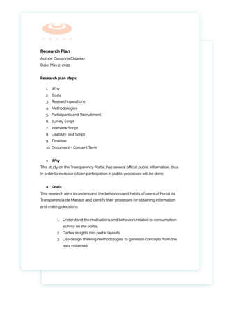
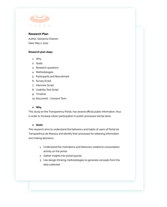
To start, a research plan was developed in order to structure the phases to be followed.
The methodological approach designed for this research includes complementary topics of interest, which will be relevant to build the understanding of users' browsing and consumption experience. The research will use three approaches, Survey, Usability Test and In-Depth Interview.
Design Process
Discovery
Phase 1 - Quantitative
At this stage, the objective is to identify the public and the relationship with the current Transparency Portal of Manaus, for this the chosen method is a survey and will be carried out through google forms.
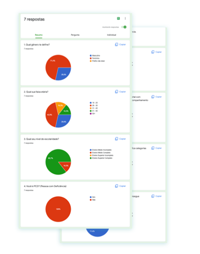
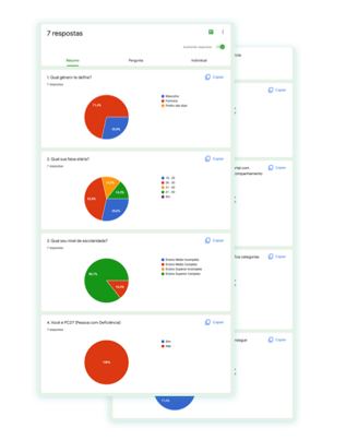
7 responses were obtained:
71.4% are women
42.9% are between 28 and 30 years old
85.7% have completed higher education
No PDC user responded to the form
71.4% are not public servants
57.1% knew that Manaus has the portal
71.4% easily identify the categories of interest • 71.4% find the information they need easily • 57.1% do not consider the portal visually pleasing
Design Process - Discovery
Phase 1
Phase 2 - Qualitative
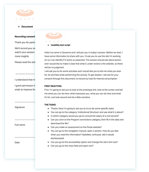
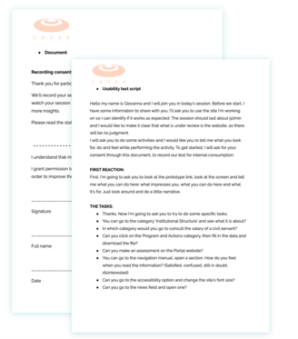
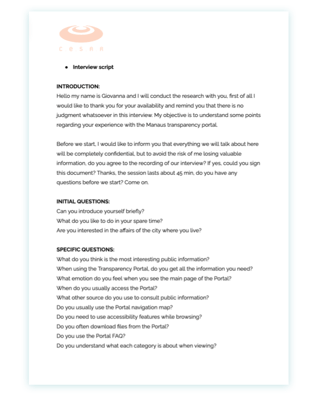
In order to observe and evaluate the usability of the current site and the decision making of users, usability tests will be carried out in person with a moderator, a support team for taking notes and recording sessions.
Design Process - Discovery
Phase 2
User 1
At first glance, the user showed curiosity.
He managed to carry out the first two activities with ease (see category description and consult salary of a civil servant).
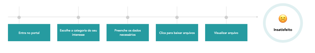
When clicking to fetch a file, the user was waiting and nothing happened.
When asking the user to carry out an evaluation, when he saw fields he sighed and said that there were many fields, then viewed the option of not identifying himself.
User described himself as uninterested when opening the navigation manual page and only looked at the images. He made accessibility tweaks with ease.
He was surprised and dissatisfied when trying to find a news
User 2
At first glance, the user was surprised to see so many options.
He managed to carry out the first two activities with ease (see category description and consult salary of a civil servant).
When clicking to download a file the user opened it and it was blank
User preferred to only evaluate by choosing an option
When viewing the manual, he chose the topic of interest and read only it.
He tried restarting the page as he found that the news had not loaded.
Phase 3 - Qualitative
Mapping values, behaviors and main recurring characteristics among users, identified as opportunities. In-depth user interviews will be conducted.
Design Process - Discovery

Phase 3
User 1
He felt doubt about public information and typed “Manaus public information”
Pantry
Instagram and city hall website
When searching for a file you do not receive a warning that "there is nothing available on that date"
Storerooms and Works
Yes, but they are "ugly"
Yes, for example to understand what the term FUNDEB is about
User 2
He was curious about the salary of a server and typed in the URL of the portal
salary and contracts
Government portal and news pages
When searching for a file you do not receive a warning that "there is nothing available on that date"
Salary and Shares
Yes, but "some have a white background" that gives an amateur face that is little care for the site
Yes, to understand unknown activities
Goal
Maria Júlia loves social causes and likes to be on top of the actions of the municipality, also to inform her patients and friends about. Its purpose is to be able to consult all previous programs and public actions and those that are planned.
Design Process - Discovery
Persona
Frustration
When she fills in the data to search for a program and downloads the file, she ends up noticing that some of them are empty. In this way, after feeling that she had the information, she lost it.
Maria Julia


25 anos - Psicologa
User journey
Goal
Rafael is extremely attuned to the affairs of the municipality, for him it is essential to consult this data on an official page, in addition to liking to show it to his customers when necessary. Its purpose is to have a good visual experience, which makes navigation on the site even easier.
Design Process - Discovery
Persona
Frustration
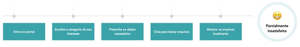
As Rafael is an active user of the portal, he tends to consult and use it to present some information to his clients. However, when browsing, he does not feel comfortable visually, so he downloads the worksheets and shows the location on his machine, preventing his customers, citizens of the municipalities from knowing and visualizing the ease of access to this information.
Rafael Andrade


30 years - Lawyer
User journey
Design Process - Discovery
Heuristic Analysis
Heuristic Analysis: Jakob Nielsen's 10 General Principles for Interaction Design:
⏳ Visibility of System Status: does not give feedback when there is no filtered file
✅ Match between system and the real world
✅ User control and freedom
⏳ Consistency and standards: despite following card standards, there are inconsistencies in the iconographic family
⏳ Error prevention: does not prevent the user from filtering non-existent content.
✅ Recognition rather than recall
❌ Flexibility and efficiency of use: no customization and creation of shortcuts
⏳ Aesthetic and minimalist design: Despite having few elements, they are arranged disproportionately and in different color charts
❌ Help users recognize, diagnose and recover from errors: no empty field or search not found message
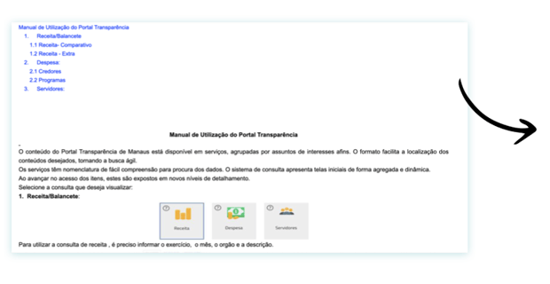
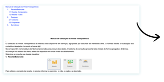
⏳ Help and documentation: the manual is confusing and poorly diagrammed.
Design Process - Discovery
Heuristic Analysis
Visibility of System Status
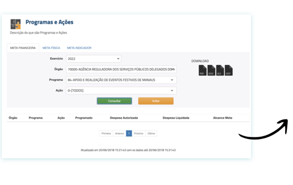
It does not give feedback when there is no filtered file or when the user downloads the file.
Error Prevention
User can download content that does not exist, blank worksheets
Helps User recognize, diagnose and recover from erros
There is no empty field message when filtering non-existent information.
Design Process - Discovery
Heuristic Analysis
Consistency and standards
Despite following card pattern, there are inconsistencies in the iconographic family
Aesthetic and minimalist design
Despite having few elements, they are disproportionately arranged and in non-institutional color charts
Design Process - Discovery
Heuristic Analysis
Help and Documentation
Navigation manual is confusing and poorly laid out
02
At this stage, after collecting data through surveys, the process of defining the project's MVP began.
Design Process
Define
Design Process - Define
MVP
Challenges:
Keep the interface clean and tidy
Keep number of categories on a single page • Avoid too many clicks to perform an action
Opportunities:
Follow the visual language of other municipal websites
Information architecture works, but needs to be better laid out • Clear naming and description support is welcome
MVP:
Feature 1 - Feedback when querying a specific data to prevent the user from downloading a blank file
Feature 2 - Tab navigation of main items
Feature 3 - Evaluation of the most agile portal
Feature 4 - News View
03
At this stage, after collecting data through surveys, the process of defining personas, user journeys and analysis of heuristics began in order to identify challenges, opportunities and define the project's MVP.
Design Process
Devolop
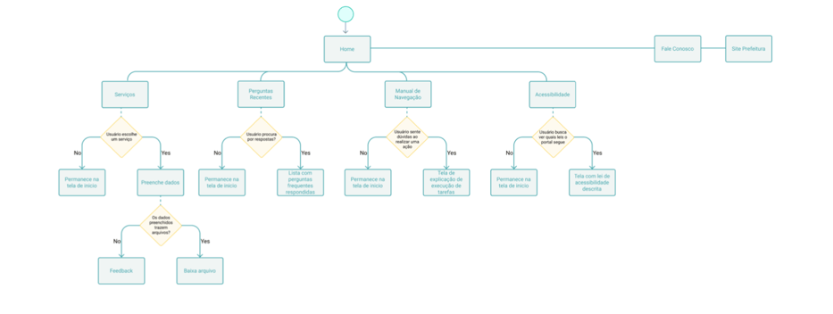
Design Process - Develop
Flowchart
Design Process - Develop
Moodboard
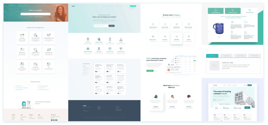
Design Process - Develop
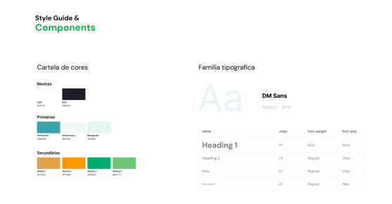
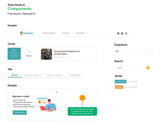
Style Guide
04
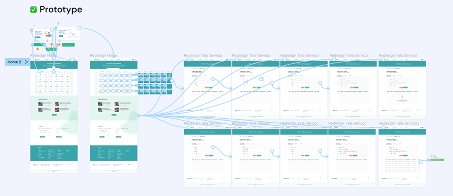
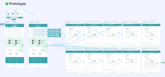
Finally, in order to meet the MPV, a prototype was developed to validate the browsing experience and the visual changes of the portal.
Design Process
Delivery

Design Process - Delivery
Protótipo
Link Prototype
Thanks for watching
giovannamchiarion@gmail.com
+39 349 813 54 18